
We are absolutely loving the bright, peppy and refreshing color of the year 2022- Very peri and we can’t wait to share the wedding inspirations! Very Peri is a dynamic periwinkle blue with a vibrant, violet-red undertone designed to evoke the glowing touchscreens of the digital world and the creative possibilities of the future. But how does Pantone see Very Peri translating to the wedding industry? We have a feeling that this color is going to rule the world of weddings in 2022 – be it design, florals, cake or stationery! And to help you out on how you can slide in this color in every aspect of your wedding, scroll down below to get a very peri overdose!
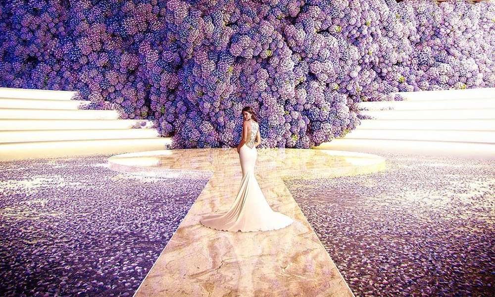
Stupendous Designs
Pictures Courtesy: @alibakhtiardesigns & @bazevents
Very Peri is an intense blend of purples, blues and red that evokes mystery and sums it up as s color that can be at the forefront of luxurious wedding decor. These designs look absolutely gorgeous and we cannot wait to see more of these in 2022!
The Perfect Hues
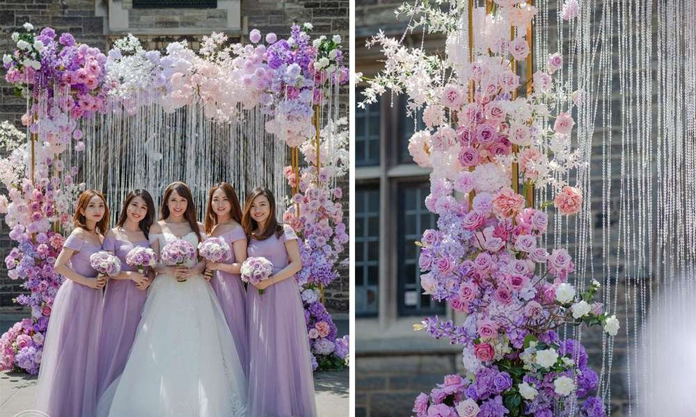
Pictures Courtesy: @agistudio / Venue: @omnikingedward
Look at these beautiful shades of purples that this bride incorporated at her wedding. The flowers are creatively placed to get a subtle texture. The bridesmaid wore a pastel shade of very peri and matched the same with their bouquets. The shade is described as the happiest and warmest of all the blue hues.
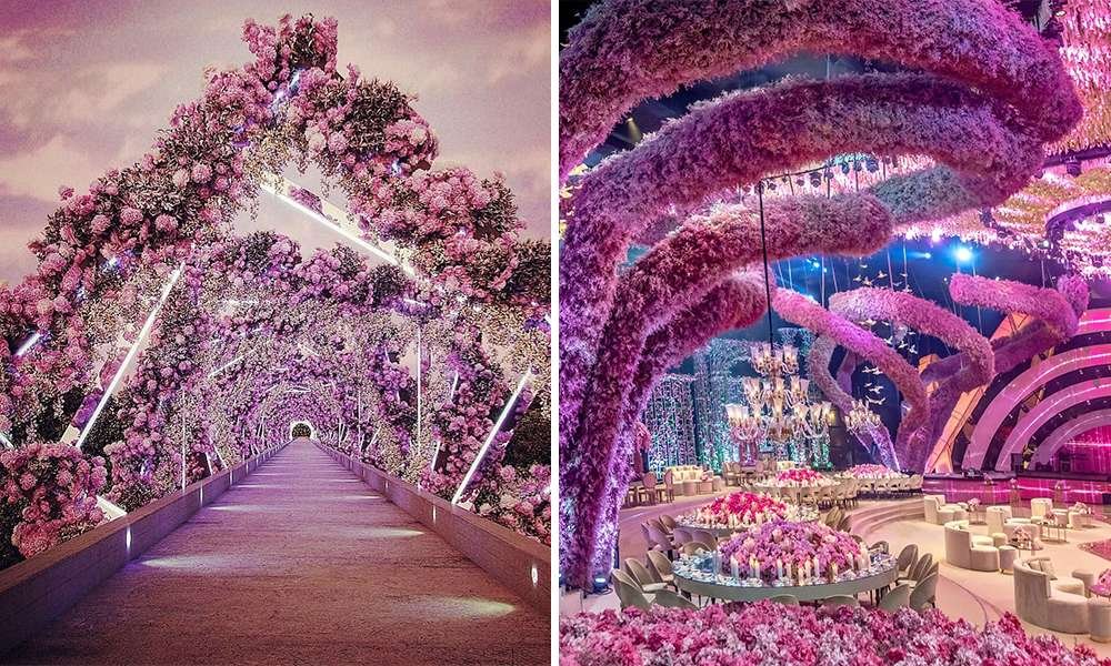
Never Enough
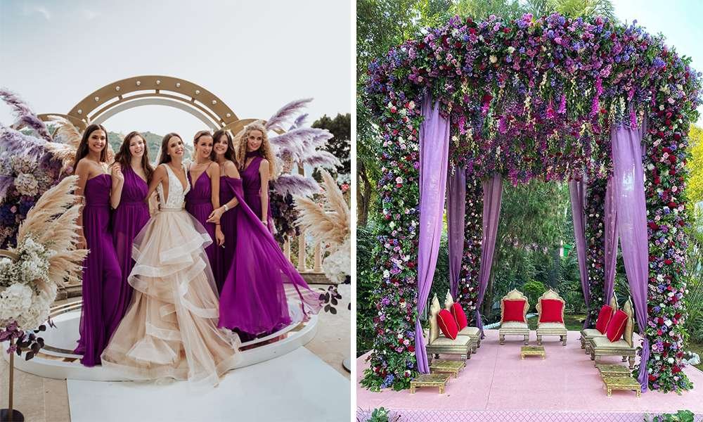
Pictures Courtesy: @martinaskrobotphotography & @theweddingdesigncompany
What happens when you mix this color with our favorite pampas grass? Yes, you get a dreamy background that has a striking contrast of two shades. In an Indian wedding, use very peri drapes for your mandap along with matching florals.
Very Yummy Cakes
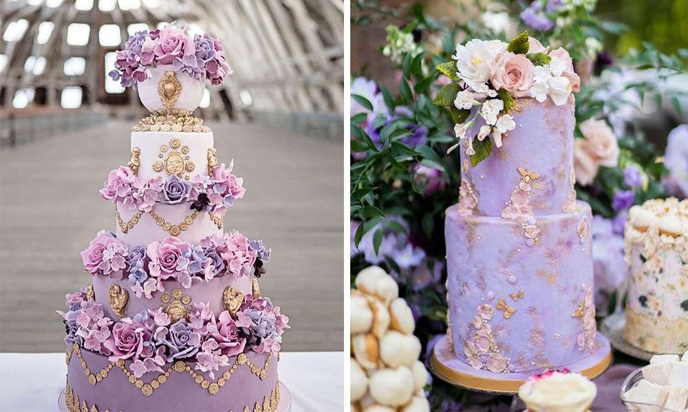
Pictures Courtesy: @elizabethscakeemporium & @lisavigliottaphotography
Purples, lilac and lavenders – with lace or ruffles, with pinks or foliage – make for the quintessential summer wedding cake. You can experiment with a lot of different hues and design pairings with this vibrant color.
Lavender Field Photography
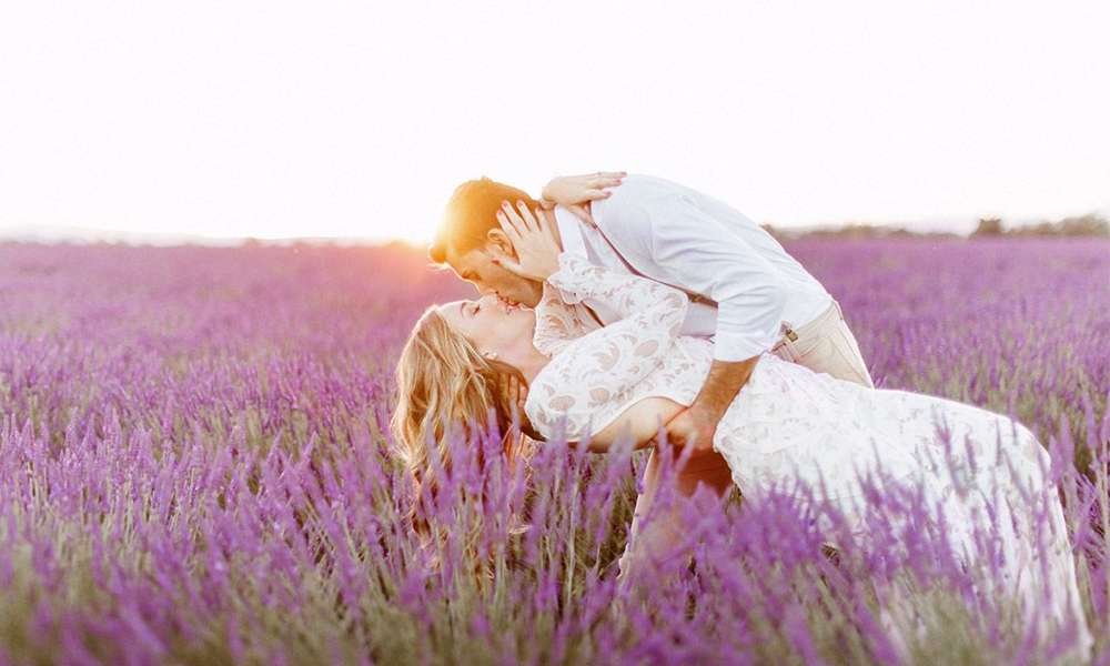
Picture Courtesy: @remidupac
Featuring a muted periwinkle blue shade enlivened by violet and red undertones, Very Peri is a magical hue that gives off a sense of whimsy. The color almost looks multifaceted and can appear to be a bluish lavender one moment and an oceanic blue the next. We are so in love with the lavender details of this picture, from the views of the Provence to the small details and authenticity of true French style.
Stationery & Buttonholes
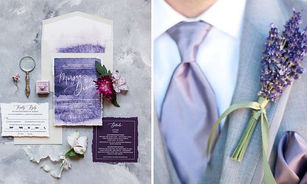
Picture Courtesy: @BrownFoxCreativ & @pinterest
Very peri represents ‘newness’ so using this color in your wedding invites could be a very lovely gesture with a special meaning for the new beginning of your life. It looks sophisticated and super pretty! These itty bitty very peri arrangements accessorize your wedding attire and make any ensemble a touch more wedding-worthy with their elegance.
High-End Fashion
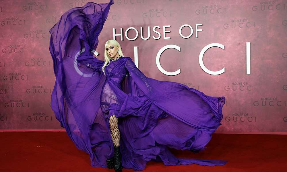
Picture Courtesy: @gucci
While the striking shade of ‘Very Peri’ might look new to many, brides and celebrities were already slaying their outfits in the offbeat shade. And they surely did manage to stand out with their eccentric choices. Lady Gaga rocked this very peri color dress at the UK Premiere of the film The House of Gucci.
Very Very Peri Makeup
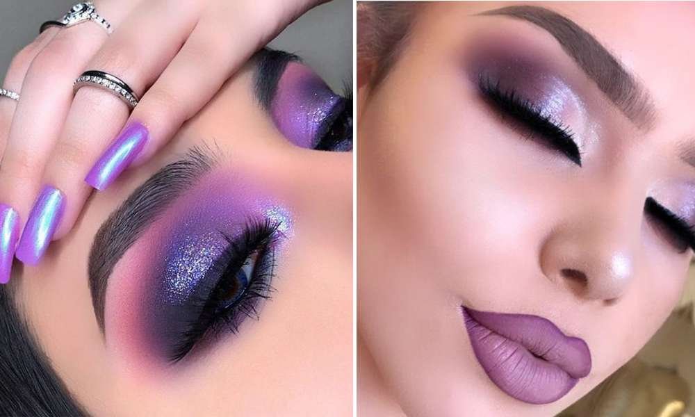
Pictures Courtesy: @makeupbykay_19 & @lacremania
It makes a bold statement for eyes, nails, and especially hair when used in a variety of finishes and applications. It can look glittery and glam, or dusty and matte.
The new color combines the faithfulness of blue with the energy and excitement of red. Pantone goes on to explain that Very Peri “helps us to embrace this altered landscape of possibilities,” allowing us to “rewrite our lives” as we emerge from isolation.
Feature Image Credit: @alibakhtiardesigns
